
Archibald 2013
Last week I finally got to see the Archibald Prize. Like I knew it would be, it was a fabulous exhibition featuring an array of Australia’s most talented portraiture artists; and yes this is beginning to sound like any other review so I’m not going to talk so much about the Archibald but instead my pick of works from the Wynne and Sulman Prizes.
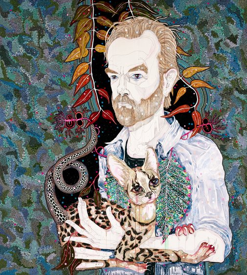
Image by Del Kathryn Barton via Art Gallery of New South Wales
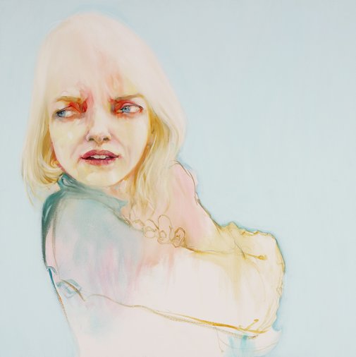
Image by Abbey McCulloch via Art Gallery of New South Wales
But before I go on it would be remise of me not to swoon a little over two works, Del Kathryn Barton’s winning piece, ‘hugo’; portrait of Hugo Weaving and Abbey McCulloch’s portrait of Naomi Watts.
[dt_divider style=”narrow”/]
Del Kathryn Barton
Del Kathryn Barton is such an incredible artist, who uses sensational bright colours; intricate and mesmerising patterns; line in an unusual manner to define areas of tone; and a most considered use of contrast which holds everything together to create such striking art works.
Her portrait of Hugo Weaving combines all the above with the immediate initial impact of the large scale she has chosen to work with. Del Kathryn Barton keeps you viewing and involved in this portrait for an extended time as there is so much intricate detail to take in, both with the subject matter and her execution of it.
[dt_divider style=”narrow”/]
Now onto Abbey McCulloch.
I have always been attracted to Abbey’s work. Her signature use of striking and slightly daring colours pull me in every time as does her sensitivity to know when to add detail with layers of paint and colour and when to represent aspects as simple organic line work.
In this instance, Abbey has used soft tranquil colours including tones of yellow, flesh pinks and soft blues to portray Naomi Watts, however, in areas the intensity of the colour contradicts and seems somewhat menacing. This is especially so in the colour, detail and interpretation of the eyes. They are more wide set than one would expect, seeming a little distorted whilst being surrounded in bright, blood red tones which immediately draw attention.
Like McCulloch’s other works there are obvious contrasts between highly detailed areas and very sparse, subtle soft details.
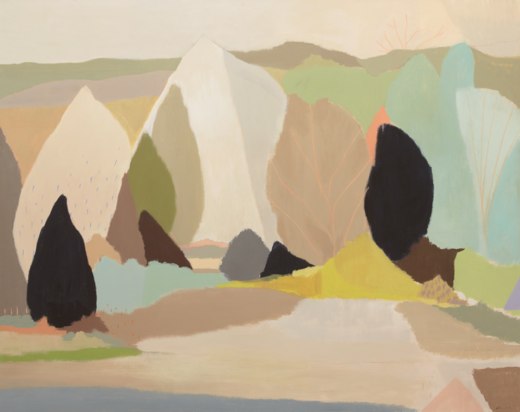
Image by Belynda Henry via Art Gallery of New South Wales
Belynda Henry
Moving onto the Wynne Prize. I was drawn to Belynda Henry’s piece ‘The trees’. My initial attraction was to her warm, inviting and almost child like representation of a landscape. The trees were portrayed as simple, yet somewhat familiar shapes. Henry’s landscape appeared as a one that I knew and trusted. It gave me the opportunity to fill in the gaps with my own memories. For me it was also a happy realisation and reminder to stop and see the beauty in the simplicity, not needing the complex.
In addition to her her simple use of shapes, Henry also applies restrained details of overly simple patterns using pastel in soft blue and coral to overlay her landscape that consists of warm colours and tones.
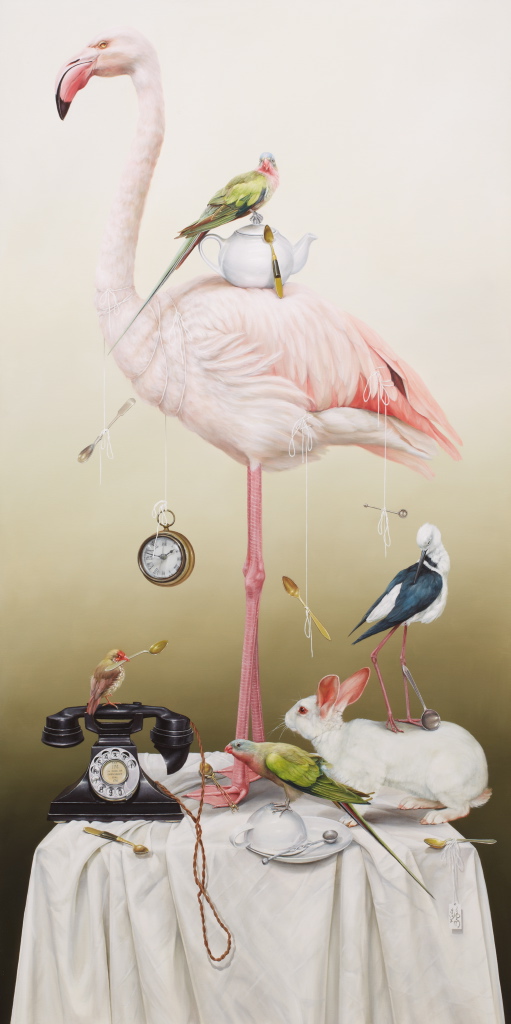
Image by Kate Bergin via Art Gallery of New South Wales
Kate Bergin
Kate Bergin was my pick of the Sulman Prize with her work ‘Croquet, tea parties and other stories from Wonderland’. I must have been in a colourful mood as again I was drawn in by the beautiful palette of fleshy pinks and gentle greens that made up the flamingos and parrots that took centre stage. Her ability to capture textures was overwhelming. The life like, soft feathers of the dominating birds contrasted with the super sleek, silver spoons and highly polished old telephone and pocket watch. At a simple glance the juxtaposition of objects seemed chaotic, yet the composition was obviously carefully planned and beautifully executed. I enjoyed that Bergin’s work reminded me of the still life’s of the Dutch Masters. In particular the carefully placed white tablecloth and thoughtful addition of items to be included on the table.
Lastly I have to mention the Young Archie 2013 and give a shout out to all the kids involved. I was especially taken by the simplicity behind the choice of subject matter. It was so lovely that I have to share some quotes from the young budding artists. One young boy painted his mum and baby sister chloe “because she would sit still”. Another boy, aged 6, featured his dad saying he is special “because he can fix tables and chairs”.
I bet some of the Archibald participants wished selecting their subject was so simple!